
Business
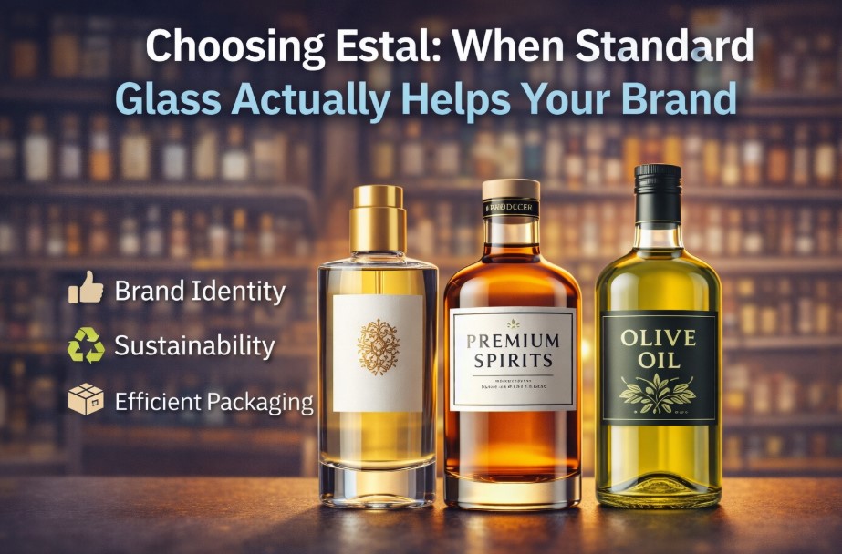
Choosing Estal: When Standard Glass Actually Helps Your Brand
You want your packaging to feel professional and work smoothly in everyday use. Standard glass mainly helps because you have less to puzzle over: a shape that sits steadily in your hand, an opening that makes sense when filling, and a closure that seals quickly and neatly. That way your packaging quickly feels “right,” without you necessarily needing a standout shape.
Standard glass is also useful if you want to decide fast and move forward. You’ve got a fixed base, so you can focus sooner on label, color, and variants instead of endlessly comparing shapes and retesting. If you’re exploring Estal, standard glass gives you a repeatable base that often fits well with filling, closing, cleaning, stacking, and presenting.
When standard glass makes your brand stronger
Standard glass often strengthens your brand when you work with repetition: multiple variants that need to stay one coherent line. One recognizable shape in two or three sizes creates calm and consistency on a shelf, a plank, or in a display. That “tidy” look helps customers see faster that it all belongs together.
Practically, it also saves work: the packaging stays the same, while your variants become clear through the label, color, or variant name. This works nicely for things like scents, flavors, or seasonal variants: your line stays recognizable without needing a new shape every time.
If you want the packaging itself to grab attention immediately (gift feel, a “statement” on the table), then standard glass can feel a bit more neutral. In that case, a more distinctive shape or a different color (for example…) gets you there faster. Useful to keep in mind: standard glass also makes it easier later to add extra sizes or variants, because your base shape is already consistent.
The 500 ml pitfall (and how to check it)
“500 ml” sounds simple, but it only works well if that size stays smooth in your day-to-day use. A bottle can be correct in volume and still be awkward: just too tall for your shelf, too wide in the hand, or hard to clean. Testing upfront prevents irritation later.
You can quickly check this in your own situation:
- Measure shelf height and depth: does it fit in rows behind each other and stay stable?
- Hold a similar shape: does your grip stay comfortable, even with wet hands?
- Do a fill test: does your funnel/spoon fit, and does it go fast and neatly without spilling?
- Do a cleaning test: can you reach the shoulder and bottom with a brush or sponge?
- Look at “usable space” (shoulder/bottom): does filling or scooping stay practical in real life?
Narrow neck vs wide opening
A narrow neck often looks calm and sleek and usually pours more neatly. It works best if filling and cleaning already fit your routine: funnel within reach, a brush that fits, and no extra hassle.
A wide opening makes filling and cleaning easier: you can reach the inside better and you work faster. Do check what it does to the look and the space it takes up: it looks less slender and can come across wider on a shelf or in a display. If your product is thick or you work with scooping (for example…), a wider opening often helps because the use naturally becomes smoother.
Closure: where it rubs in daily use
The closure is what you touch most often. If it works nicely, the whole package immediately feels better even with a standard bottle or jar. You’re mainly looking for predictability: opening/closing, dosing, and taking it with you should feel logical.
What to look for:
- Do you open it often? Choose something you can grip easily (not too small, not too slippery), so twisting it back on is quick.
- Do you take it with you? Then a closure that truly stays sealed and keeps the rim clean helps.
- Do you want a fine mist (for example, for personal care or a blend)? Then a mist spray cap helps because you can dose more evenly than with a standard cap.
Some closures feel extra “solid,” but they also add extra actions (more twisting, extra steps). The more often someone uses it, the faster it starts to annoy. Also, watch the height: a taller cap can make stacking or storing less convenient. A quick shelf- or drawer-height check prevents that “almost fits” problem.
A simple decision guide that usually holds up
You want a choice that feels logical every time in use. Briefly describe your routine: filling, cleaning, storing, and daily use.
Are you mainly looking for consistency and speed (multiple variants, repeat orders, one calm line)? Then start with one standard shape, two sizes, and one type of closure. That keeps your line clear and limits hassle with parts.
Does your product require a specific action (precise dosing, thick product, scooping)? Then choose the opening and closure first, and only then the shape. That way, filling, dosing, and cleaning stay smooth without extra tools or awkward steps.
Label and decoration: where standard glass quietly wins
Standard shapes usually give you a more predictable labeling area. That matters more than most people expect, because labels are what carry your brand story, your compliance info, and the “this feels legit” signal.
A bottle can look perfect on a screen and still fight your label in real life. Curves, tapers, and shoulders can cause small issues: wrinkles, lifting edges, or a label that sits slightly crooked, even when applied carefully. Standard glass often reduces that risk because the straight panel is more consistent.
A quick way to pressure-test your label plan:
- Identify the flattest label zone. If the body subtly tapers, your label might “walk” upward as it’s applied.
- Mock it with paper first. Wrap a printed paper strip around a similar bottle and see where it creases.
- Decide to finish early. Matte, gloss, soft-touch, metallic, transparent: each reads differently under lights and in photos.
- Check real handling. If your product is used with wet hands or oily fingers, a super-smooth label can start to feel slippery.
- Think about scanning. If you use barcodes, test them on curved glass and reflective labels. Sometimes it is fine, sometimes it gets finicky.
If you want a premium look without changing the shape, decoration does a lot of heavy lifting: a textured label stock, a clean emboss effect, or a minimal mark on the front with more detail on the back. Standard glass gives you a calmer canvas for that.
Clear vs tinted glass: aesthetics and protection
Glass color is not only a style. For some products, it’s practical protection. Light exposure can quietly change scent, taste, or quality over time. If your product is sensitive, tinted glass can be the simplest insurance.
Even when protection is not critical, color still affects perception. Clear glass often communicates “clean” and “honest.” Amber or darker tints can feel apothecary, heritage, or premium. Soft tints can look modern, but they also need consistency across batches, otherwise a line of bottles can look slightly mismatched on a shelf.
Before you choose:
- Think about where it will live. A sunny shop window is different from a bathroom cabinet.
- Consider your photography. Clear glass shows the product; tinted glass shapes the mood.
- Keep your variants in mind. If you want a coherent line, make sure the glass color supports that, not just one SKU.
If your goal is speed, you can start with clear glass and upgrade later. If protection matters, pick the protective option first and design your label system around it.
Weight and “feel”: premium signals vs practical costs
One of the fastest ways to change the perceived quality of a standard bottle is weight. Heavier glass often feels more premium in-hand. It also feels more stable on the counter.
But weight has trade-offs. Shipping becomes more expensive, and breakage risk can rise if your secondary packaging is not strong enough. If you sell online, this becomes a real operational detail, not a branding theory.
A simple test that usually reveals the truth: fill two sample bottles, one lighter and one heavier, and use them for a few days. Pick them up one-handed, twist the cap, pour, wipe the rim, and put them back. If the heavier one feels “nice” but starts to annoy after repeated use, it might not be the premium win you think it is.
Dispensing details: make the product behave
The way the product comes out matters more than the bottle’s silhouette. People remember mess. They also remember when something feels effortless.
If your product is thin and pourable, a narrow neck and a controlled pour lip can keep it neat. If it’s thicker, you might need a wider opening, a reducer insert, a pump, or a dropper style that suits the viscosity. The wrong pairing creates the classic frustration: too much comes out, or nothing comes out until you shake it aggressively.
A practical check that saves time:
- Time one use. From opening to dosing to closing. If it takes longer than it should, users feel it.
- Wipe the rim after dosing. If residue builds up, the packaging will start to look dirty quickly.
- Test for travel. Put it in a bag on its side for an hour. If it leaks, it will eventually leak for customers too.
This is where “standard glass” can still feel premium. A clean dose and a clean rim often beats a fancy silhouette that makes a mess.
Secondary packaging: the hidden part of the experience
Glass is a material you need to respect in transit and storage. If you sell in-store only, your concerns are mostly stacking and shelf stability. If you ship direct-to-consumer, you need a plan for protection that still looks good.
A few practical realities:
- A perfect bottle can still fail if it knocks against another bottle.
- Inserts and dividers are not glamorous, but they cut breakage quickly.
- If your cap is tall, your carton height grows, and your shipping costs follow.
If you want to move fast, choose a bottle that fits common carton sizes and can be packed tightly without odd gaps. Standard shapes tend to behave better here because the geometry is simpler.
A “fast but smart” mini-pilot
If you want to avoid guessing, do a small pilot before you commit fully. Not a huge run. Just enough to expose friction.
A simple pilot that usually reveals everything:
- Get samples of two shapes max, two openings max, and two closures max.
- Run a small fill session and track time per unit.
- Clean a few units properly and see what annoys you.
- Store them on your actual shelf and in your actual drawer.
- Hand a few to real users and ask one question: what felt annoying?
Standard glass shines when you run this test because it reduces variables. You are not trying to solve ten problems at once. You are checking the basics: does it feel right, does it work, and does it stay consistent across variants.
A final decision guide that stays practical
If you want fewer regrets, decide in this order:
- Routine first: how it’s filled, cleaned, stored, and used daily.
- Opening next: narrow vs wide based on what the product needs.
- Closure after that: grip, seal, dosing, and cap height.
- Shape last: choose the standard form that supports the above without fighting it.
If you do those four steps, standard glass stops being “generic.” It becomes intentional. It is the quiet kind of packaging choice that customers do not overthink, but they feel it every time they open, use, and put it back.)


Fish Oil Pills Benefits for Brain Function and Mental Focus

Why Your AC Runs All Day but Your House Still Feels Hot

Omega-3 Supplements for Healthy Blood Pressure Support

Complete Guide to Using Uitly for Link Management

How to Build a Balanced Portfolio Using Top-Rated SBI SIP Plans
-

 Law2 months ago
What Accident Representation Covers in Injury Cases Today
-

 Tech2 months ago
Best 7 Mainframe Modernization Companies for Cloud Migration (AWS, Azure, GCP)
-

 Tech2 months ago
Why UX Work Fails Quietly — and What to Do About It
-

 Tech1 month ago
Best Site Selection Software for Retail Expansion: A Data-Driven Guide