
Kitchen
Large Format Kitchen Tiles: Redefining Space and Visual Continuity
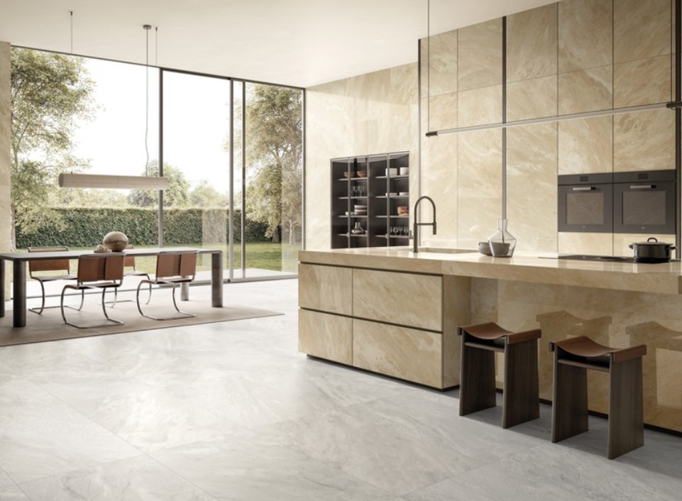
Far from being a passing trend, generous tile dimensions respond to a growing demand for continuity and spatial clarity. By reducing fragmentation and emphasising proportion, they reshape the way a kitchen is perceived and experienced.
Rethinking proportion: when scale becomes a design tool
The impact of large-format tiles begins with proportion. Traditional, smaller tiles divide surfaces into multiple visual segments, drawing attention to grout lines and pattern repetition. Larger formats, by contrast, create broader, more cohesive planes.
This reduction in visual interruption allows the eye to travel more freely across the room. Floors appear wider, and the overall layout feels more composed. In kitchens where cabinetry often occupies significant wall space, expansive floor tiles provide balance, preventing the design from feeling overly busy.
Seamless transitions between the kitchen and the living areas
Modern homes increasingly favour fluid connections between cooking, dining, and relaxation zones. In such settings, flooring continuity plays a central role. Large-format kitchen tiles support this approach by extending uninterrupted across different functional areas.
Using the same surface from the kitchen to the dining space strengthens spatial cohesion and eliminates abrupt changes in material. The result is a unified environment in which zones are defined by furniture and lighting rather than by flooring shifts.
This continuity can also extend to adjacent areas, reinforcing the interior’s architectural language. By limiting visual thresholds, large-format tiles help create interiors that feel open, balanced, and intentionally connected.
Vertical expansion: large format tiles beyond flooring
While often associated with floors, large-format tiles can also transform vertical surfaces. Full-height wall applications create a sense of architectural depth, particularly when paired with handleless cabinetry and integrated storage.
Cladding kitchen islands or peninsulas with matching tiles further enhances the sense of continuity. Instead of appearing as separate elements, these volumes read as sculptural extensions of the surrounding surfaces. The kitchen becomes a composition of unified planes rather than a collection of individual components.
On feature walls, expansive slabs allow material patterns to unfold naturally. Veining, subtle tonal variations, or concrete-inspired textures can be appreciated in their entirety, lending the space a refined and controlled visual impact.
Light, reflection, and material expression
Large surfaces interact with light in distinctive ways. Fewer grout lines mean fewer interruptions to reflection, allowing natural and artificial light to move more evenly across the floor. This contributes to a brighter, more harmonious atmosphere.
Material expression also benefits from scale. Marble-inspired finishes reveal their veining more convincingly when uninterrupted, while stone and concrete effects gain authenticity when displayed across generous expanses. The design reads as a continuous material statement rather than a repeated motif.
Technical considerations behind the aesthetics
The visual simplicity of large-format tiles relies heavily on technical precision. Substrates must be perfectly level to prevent lippage and ensure alignment. Even minimal irregularities become more noticeable with larger dimensions.
Installation requires careful planning, particularly around edges, corners, and integrated elements. Accurate cutting and meticulous joint management are essential to preserve the intended seamless effect.
A contemporary statement with lasting impact
Large format kitchen tiles represent a confident yet restrained design choice. They reduce visual noise, enhance proportion, and support spatial fluidity without relying on overt decoration.
By prioritising continuity and material clarity, they contribute to kitchens that feel open, balanced, and enduring. In a design landscape increasingly focused on space and light, scale is no longer secondary. It is central to the room’s experience, shaping interiors that remain relevant well beyond temporary stylistic trends.
Ceramiche Refin: material as conscious architecture
Every contemporary project begins with a material choice. Before form, it is the surface that defines atmosphere, depth, and visual coherence. In today’s interiors, materials play a structural role: they shape identity, modulate light, and support function.
This awareness guides Ceramiche Refin, an industrial company that has interpreted porcelain stoneware as a design language since 1962. As part of the Concorde Group, the brand combines international vision with Italian manufacturing culture. The entire production cycle takes place in-house, ensuring consistency, reliability, and continuity between concept and result.
Here, made in Italy represents a method grounded in over sixty years of industrial expertise. Innovation, precision, and sustainability – through low-impact technologies, waste recovery, and emission reduction – define a responsible and structured manufacturing model.
Among the most emblematic expressions of its material research is PRESTIGIO KALEIDOS. The collection offers a dramatic, metamorphic interpretation of the surface, animated by shifting nuances, reflections, and luminous accents that change with light and perspective. Available in 120×120, 60×120, and 120×278 slab formats, in Matt and Glossy finishes with dedicated tones, it provides extensive compositional freedom and coordinated decorative elements.
A more rigorous, industrial sensitivity defines OSMOS. The collection elevates controlled imperfection, with subtle variations and material traces shaping its identity. Shades including Calce, Cenere, Nebbia, Ruggine, and Tortora create refined, cohesive environments suited to both residential and contract contexts.
INK introduces a more expressive dimension. Translating creative gesture into ceramic form, it turns the surface into a visual narrative. The 80×80 format enhances pattern perception, while a palette ranging from neutrals to warm tones and broader accents allows diverse spatial interpretations, balancing graphic strength and formal control.
The project RELIEFS completes the path with a distinctly three-dimensional approach. Six sculptural textures transform walls into active architectural elements, interacting with light to generate dynamic chiaroscuro effects. Grooves, engravings, and structured geometries establish rhythm and depth across residential and professional spaces.
Through a consistent industrial vision and ongoing dialogue with architects and designers, Ceramiche Refin continues to interpret porcelain stoneware as a conscious architectural material, where technical precision, aesthetic research, and environmental responsibility converge.


Choosing Estal: When Standard Glass Actually Helps Your Brand

Large Format Kitchen Tiles: Redefining Space and Visual Continuity

The Full Breakdown: What International Travel Insurance Covers in Medical Emergencies?

What Exactly Happens After a Peace Bond Expiration?

What is PuzuTask Com? A Complete Guide for Beginners
-

 Tech2 months ago
Why OMS Testing Determines E-commerce Reliability
-

 Tech2 months ago
Aikido vs Wiz vs Snyk vs Checkmarx: DevSecOps Platforms
-

 Home Improvement2 months ago
Don’t Buy a Flop: A Buyer’s Checklist for High-Quality Pop-Up Tent Frames and Mechanisms
-

 Food2 months ago
How Brown Sugar is Made: Ingredients, Process, and Uses