
Tech
The Spreadsheet Habit That Quietly Breaks Business Dashboards as Teams Scale

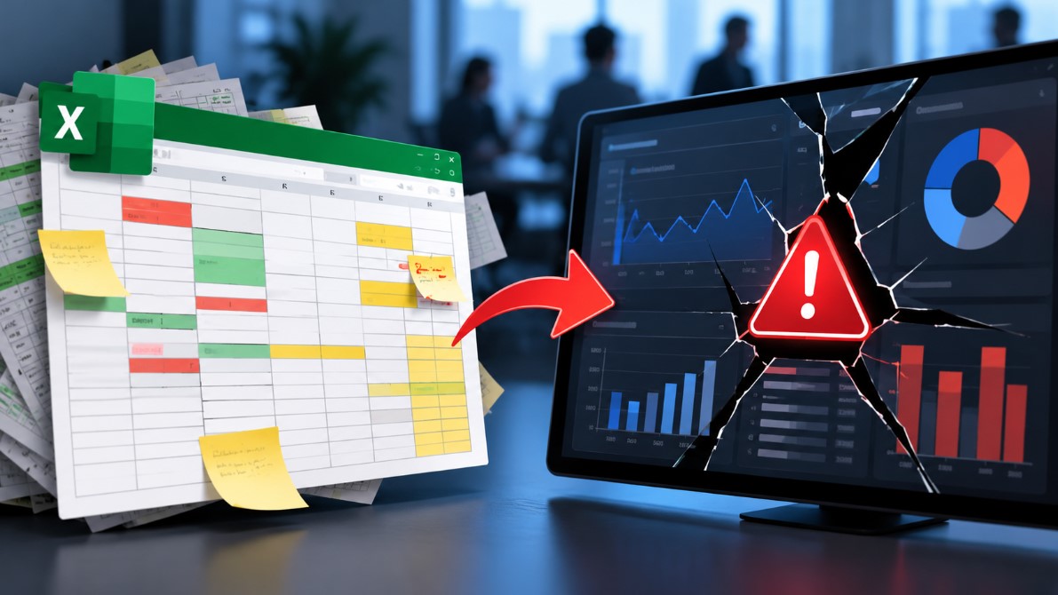
Most business dashboards don’t start out as dashboards. They start as a spreadsheet one person built to track their own patch — a handful of projects, a sales pipeline, a set of KPIs for their own team — and it works perfectly, because one person both enters the data and reads the output. The trouble starts the day that dashboard gets promoted: someone screenshots it into a board pack, or it becomes “the” tracker three other teams update, or it gets wired into a weekly leadership review. Nobody rebuilt it for that job. It’s still running on habits that were harmless at one user and become expensive at five.
We see this pattern constantly running hands-on Excel and Power BI training for business teams, and it’s rarely the tool that’s the problem. A pivot table, a SUMIFS formula and a handful of conditional-formatting rules can hold up a genuinely useful management dashboard for years. What breaks it is four specific habits that quietly change behaviour once more than one person is touching the underlying data, or once the numbers start feeding a chart or a KPI card instead of just sitting in a cell where a human can sanity-check them on sight.
Habit 1: Manual re-entry instead of a lookup formula
The most common failure mode in a portfolio or project dashboard: a “Status” or “RAG rating” column (red/amber/green) gets typed by hand for every project, on every refresh, rather than pulled automatically from each project’s own tracker via VLOOKUP, INDEX/MATCH or XLOOKUP. One person doing this consistently is fine — they have a mental model of what “Amber” means and apply it the same way each week. The moment two or three people share the job, that consistency disappears. One person types “Amber”, another types “AMBER ” with a trailing space, a third types “At Risk” because that’s what it says on their project’s own sheet. To a human glancing at the column, it still reads as a dashboard. To the COUNTIF or pivot table counting RAG statuses behind the summary chart, those are three different categories, and the chart on the dashboard quietly undercounts every variant except whichever string happens to match the formula’s filter.
The same habit shows up in sales and KPI dashboards as a manually re-typed “Region” or “Product Line” field, rather than one pulled from a master reference table. We reviewed one client’s regional sales dashboard where “North West” appeared four different ways across a year of manual entry — “NW”, “North West”, “North-West” and, memorably, “Northwest” from a colleague who’d worked at a US-headquartered firm before. The regional totals on the summary tile were quietly short-counting the North West by roughly a quarter, because three of the four spellings weren’t being swept up by the SUMIF driving that number.
The fix is mechanical, not a matter of training people to type more carefully: pull the field from one source table with a lookup formula, so there’s exactly one place anyone can ever edit it, and the dashboard reads from that single column every time. Nobody has to remember a style guide, because there’s nothing left for a style guide to govern.
Habit 2: No error-checking on formulas that silently return the wrong row
This is the habit most likely to put a genuinely wrong number directly on a leadership dashboard, because it fails silently. A lookup formula that isn’t locked to an exact match — the fourth argument in VLOOKUP, or the match-type argument in XLOOKUP — doesn’t error out when it can’t find what it’s looking for. It returns the nearest value *below* the one requested instead, and because the result still looks like a plausible number sitting in a normal-looking cell, nobody questions it.
We ask every training group running a live dashboard to check one specific thing: open every lookup formula feeding a KPI card or chart and confirm the match-type argument is explicitly set to exact, not left on its default approximate behaviour. In a one-off review of a live client dashboard — a monthly commission-tracking sheet feeding a leadership summary tile — this single setting was wrong on three of nine lookup columns. One of those three was pulling a salesperson’s commission banding from the row *above* their actual sales figure whenever their number landed between two threshold values instead of exactly on one, which meant the dashboard’s “total commission payable” tile had been quietly wrong for at least two reporting cycles before anyone noticed, because the error always produced a number in the right ballpark — just not the right number.
The dangerous part of this habit is specifically that it’s invisible on the dashboard itself. A broken manual entry looks odd to a careful eye. A wrong exact-vs-approximate lookup produces a completely unremarkable-looking figure that happens to be sourced from the wrong row, and a dashboard’s entire job is to be glanced at rather than audited.
Habit 3: Version chaos from emailed copies instead of one source of truth
The dashboard gets emailed as an attachment the night before a board meeting for “one quick check,” comes back from two different reviewers with two different sets of tracked changes, and now there are three files in circulation with silently diverging numbers and no reliable way to tell which one is current. This is less an Excel problem than a process problem, but it’s consistently the single biggest driver of “hold on, which version are we presenting from” conversations we hear in training sessions — and for a dashboard specifically, the stakes are higher than for an internal tracker, because a dashboard’s whole purpose is being presented to people who will make a decision based on what’s on the slide.
We’ve seen this surface in a genuinely awkward way: two senior stakeholders in the same meeting working from two different emailed copies of the same quarterly dashboard, each confident their number was the live one, because each had made a small edit to their own copy the previous evening. Neither was deliberately wrong. Both were working from a file that had, at some point, been the master — just not the same point.
A dashboard shared from one location — a SharePoint or OneDrive link that everyone opens and edits directly, rather than a local copy attached to an email and mailed back and forth — removes the fork entirely, because there is only ever one file in existence. It costs nothing to set up and fixes the single most expensive habit on this list, precisely because dashboard numbers get repeated out loud in rooms where nobody checks the file path before quoting a figure.
Habit 4: Copied formulas whose references quietly drift
Dragging a formula down or across a sheet shifts its relative references by design — that’s usually exactly what you want when extending a table. The problem is specifically when a formula references a fixed input that’s supposed to stay constant across the whole sheet: a VAT rate, a target figure, a date-range cutoff cell feeding every chart on a dashboard — and that reference isn’t locked with a dollar sign ($). Copy the formula fifty rows down, and the “fixed” reference has silently moved fifty rows down with it too, usually landing on a blank cell, usually returning a zero or a #REF! error that gets ignored because it’s sitting in a row nobody’s looking at that particular week.
On a dashboard built around SUMIFS or COUNTIFS criteria ranges, the same drift shows up in a more deceptive form: a criteria range that should always point at the same fixed block of category labels instead creeps down the sheet one row at a time as the formula gets copied to feed each new chart series. The chart still renders. It still has bars of roughly plausible height. It’s just quietly summing against the wrong slice of the category list for every series after the first, and because a chart doesn’t show you its underlying range the way a formula bar does, this is one of the hardest versions of this habit to catch just by looking at the dashboard.
The one check that catches all four habits early, before a wrong number ever reaches a room: before presenting or relying on a dashboard’s output for a decision, pick one tile or chart series at random and manually re-derive its number from the underlying source data. If it doesn’t match what the dashboard shows, there’s a lookup, a reference, or a duplicated manual entry somewhere upstream — and it’s considerably better to find that in a quiet ten minutes before the meeting than to have someone in the room ask why the regional total doesn’t add up.
None ofthis requires a new tool, a rebuild, or a move to a different platform. It requires treating the dashboard the way you’d treat any shared system the moment more than one person touches it or more than one person reads its output in a room that makes decisions: one source of truth per field, exact-match lookups on anything a chart or KPI card depends on, a single shared file rather than emailed copies, and locked references on anything meant to stay fixed. The tools that get blamed for “not scaling past one user” are usually fine. The habits built into them during the one-person phase are what actually break.
Author Info:

Sam Webb writes on behalf of Future Savvy, a UK-based corporate training provider delivering hands-on Excel,
Power BI, SQL and Power Automate courses for business teams. A related walkthrough on getting lookups right
is here: https://www.futuresavvy.co.uk/tips-tricks/how-to-use-excel- lookup-with-multiple-criteria



Eileen Gu: Age, Parents, 2026 Olympics, Modeling Career, Height and Personal Life

18Moa – Website Directories, Online Discovery, and Safer Browsing

Understanding the American XL Bully Ban in the UK: Rules and Changes in 2026

Best UI/UX Design Agencies for Enterprise Products in 2026

Broken Keyboard Grok Answer: How to Understand and Solve the Coding Problem
-
 Celebrity3 weeks ago
Eileen Gu: Age, Parents, 2026 Olympics, Modeling Career, Height and Personal Life
-
 Tech3 weeks ago
18Moa – Website Directories, Online Discovery, and Safer Browsing
-
 Animals3 weeks ago
Understanding the American XL Bully Ban in the UK: Rules and Changes in 2026
-

 Finance2 months ago
Loan Officer’s Guide: How to Calculate Self-Employed Income?